Today, we're taking about book covers. I always kind of dread talking about covers because I know nothing about art. I have opinions about art, but I don't have the vocabulary to express those opinions.
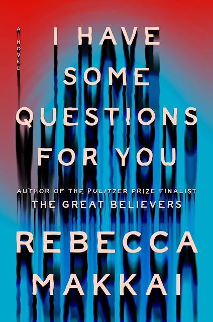
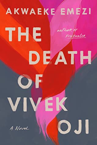
Here are 10 text-only covers that I think are beautiful. However, I suspect calling them "text-only" is wrong because a few of them have a tiny bit more than just text. Maybe they're minimalist covers? Text-focused covers? They're covers where "the artist uses font, color, and shapes to show a book's essence." That is too many words to fit in a blog post title, so we're calling these "text-only" covers.


I love a good text-only cover. It can be powerful. And it's fun to see how fonts and colors play into that.
ReplyDeleteI agree with Tanya, a text-forward cover is very striking and powerful. I don't necessarily gravitate to them all the time, but they can be amazing!
ReplyDeleteText-only book covers are eye catching.
ReplyDeleteHere is my Top Ten Tuesday post.
Lydia
This is such a cool trend.
ReplyDeleteHere is our Top Ten Tuesday.
Astilbe
The Illuminae series has some of the coolest text-only covers I have ever seen. They are just so fun to look at, especially with the quotes that show through.
ReplyDeleteI really like how some text only covers can be really simple but really powerful
ReplyDeleteYou should submit this topic to Jana! It's great!! Enjoy the rest of your week.
ReplyDeleteIt's so interesting, I've always thought that a book cover needed to be eye-catching, but these are so good and I never thought about how good font design can be so eye-catching too.
ReplyDeleteThese are great. I can hardly ever find all text covers on my read shelf. Illuminae is a fabulous pick. Those books were really fantastic with those cello covers.
ReplyDeleteAddie is my favorite, love the constellations inspiration, is simple but elegant and pretty
ReplyDeleteOooh! These covers are beautiful! Great list!
ReplyDeleteHere’s my TTT
Rabbit Ears Book Blog: WORLD’S WEIRDEST BOOK BLOG!
I'm always confused by the term "typographical" cover, which I think is the same as text-only. Does that mean there is ONLY text or just that the majority is text? I think the latter is correct, but who knows??
ReplyDeleteHappy TTT!
love these covers and saving this idea for a future freebie TTT!! My post is here
ReplyDeleteText-forward covers can be so eye-catching. The font choices and colors can make or break a book's sales.
ReplyDeletePam @ Read! Bake! Create!
https://readbakecreate.com/see-the-forest-for-the-trees-book-covers-featuring-trees/
It's surprising to me that text-only covers can be so beautiful, especially Illuminae.
ReplyDeleteLove that although these are only text, they are all so interesting and unique.
ReplyDeleteThe first time I saw one of these test-only book covers I was not a fan, but they've grown on me over the years. These ten are great! :D
ReplyDeleteI love so many of these! I always loved the design of Illuminae, but there are some other great ones here too- big fan of Vivek Oji and The Watsons!
ReplyDeleteThe Emezi's cover seems to draw in my attention. Something about the colors and typeface.
ReplyDeleteHaving a cover with just text be visually appealing is really a whole speciality. Like I can't do it :D
ReplyDeleteI really like your examples especially the What It Means When A Man Falls From The Sky. It is powerful and different. Not expected.
ReplyDeleteOoh, great pick! I think it depends on whether a text only cover grabs me more than images, but some of these are really great picks. I hadn't seen the Watsons Go to Birmingham in this version before. Great picks! I like the one Why I'm No Longer Talking to White People About Race. What a great statement that one is!
ReplyDeleteYes! To tell the truth, I always dread posts about book covers because I always focus only on the text. This is a great set of examples.
ReplyDeleteYou made me notice that the book I reviewed this weekend has a text-only cover! Now that I read mainly kindle books I notice covers less than when a book was an object and I looked at the cover every time I opened it.
ReplyDeletebest, mae at maefood.blogspot.com